
Dein Portfolio mit Manablox · Teil 5 von 7 der Serie
Teil 5: Layout, Hero und Projektkarten
Gib der Astro-Website ein Layout mit Kopf- und Fußbereich, einen großen Hero, Projektkarten mit Titelbildern und eine richtige Projektseite.
Quest-Ziele
- Ein Layout mit Kopfbereich, Menü und Fußbereich bauen
- Die Website mit CSS Custom Properties gestalten
- In einer Komponente weitere Daten laden
- Karten mit CSS Grid anordnen
- Einer Seite einen Abschnitt hinzufügen, ohne den Code anzufassen
In diesem Teil wird aus der schlichten Seite aus Teil 4 ein Portfolio. Lass pnpm dev in my-site weiterlaufen: Jedes Mal, wenn du eine Datei speicherst, lädt der Browser unter localhost:3005 mit der Änderung neu. Du ersetzt Dateien komplett: Markier alles in der Datei, lösch es und füg die neue Fassung ein.
Das Layout
src/layouts/Site.astro ist das HTML um jede Seite. Die neue Fassung bekommt einen Kopfbereich mit deinem Namen und dem Menü, einen Fußbereich und die Styles, die sich die ganze Website teilt:
---
import { BLOCK_GRID_CSS } from '@manablox/public-sdk';
import { manablox } from '../lib/manablox';

interface Props {
  title: string;
  bare?: boolean;
}

const { title, bare = false } = Astro.props;
const siteName = 'Robin Pixel';
// The home page lives at /home too, and that is the address the menu links to.
const path = Astro.url.pathname === '/' ? '/home' : Astro.url.pathname;

// The menu called "main", edited in the admin under Menus.
const menu = bare ? null : await manablox().menu('main');
const year = new Date().getFullYear();
---

<html lang="en">
  <head>
    <meta charset="utf-8" />
    <meta name="viewport" content="width=device-width, initial-scale=1" />
    <title>{title === siteName ? title : `${title} · ${siteName}`}</title>
    <style set:html={BLOCK_GRID_CSS}></style>
  </head>
  <body>
    {
      !bare && (
        <header class="site-header">
          <a class="logo" href="/">{siteName}</a>
          <nav>
            {menu?.items.map((item) => (
              <a href={item.href ?? '#'} aria-current={item.href === path ? 'page' : undefined}>
                {item.label}
              </a>
            ))}
          </nav>
        </header>
      )
    }
    <main class:list={['site', { bare }]}>
      <slot />
    </main>
    {!bare && <footer class="site-footer">© {year} {siteName}</footer>}
  </body>
</html>

<style is:global>
  :root {
    --paper: #fdf8f3;
    --ink: #1f1a2e;
    --muted: #6b6480;
    --line: #ebe2d9;
    --pink: #d6246e;
    --radius: 16px;
  }
  * {
    box-sizing: border-box;
  }
  body {
    margin: 0;
    background: var(--paper);
    color: var(--ink);
    font: 17px/1.6 system-ui, sans-serif;
  }
  a {
    color: var(--pink);
  }
  h1,
  h2,
  h3 {
    line-height: 1.15;
  }
  img {
    display: block;
    max-width: 100%;
    height: auto;
    /* Robin's pictures are pixel art: keep the pixels sharp instead of blurring them. */
    image-rendering: pixelated;
  }

  .site-header,
  .site,
  .site-footer {
    max-width: 64rem;
    margin: 0 auto;
    padding: 0 1.5rem;
  }
  .site-header {
    display: flex;
    flex-wrap: wrap;
    align-items: center;
    justify-content: space-between;
    gap: 1rem;
    padding-block: 1.5rem;
  }
  .logo {
    color: var(--ink);
    font-size: 1.25rem;
    font-weight: 800;
    text-decoration: none;
  }
  .site-header nav {
    display: flex;
    flex-wrap: wrap;
    gap: 1.25rem;
  }
  .site-header nav a {
    color: var(--ink);
    font-weight: 600;
    text-decoration: none;
  }
  .site-header nav a:hover,
  .site-header nav a[aria-current='page'] {
    color: var(--pink);
  }
  .site {
    padding-bottom: 4rem;
  }
  .site.bare {
    padding-top: 1.5rem;
  }
  .site-footer {
    border-top: 1px solid var(--line);
    padding-block: 2rem;
    color: var(--muted);
    font-size: 0.875rem;
  }

  .lead {
    color: var(--muted);
    font-size: 1.25rem;
  }
  .button {
    display: inline-block;
    border-radius: 999px;
    background: var(--pink);
    color: white;
    padding: 0.75rem 1.5rem;
    font-weight: 700;
    text-decoration: none;
  }
  .button:hover {
    filter: brightness(1.1);
  }
  .block {
    margin-top: 4rem;
  }
  .block h2 {
    font-size: 2rem;
    margin: 0 0 1.5rem;
  }
  .rounded {
    border-radius: var(--radius);
  }
</style>
Was hier passiert:
siteNameist dein Name. Trag deinen ein.Das Layout lädt das Menü namens
mainselbst, das du im Admin unter Menus bearbeitest.menu?.items.map(…)macht aus jedem Eintrag einen Link, undaria-currentmarkiert die Seite, auf der du gerade bist, die das CSS pink färbt.bareist für die Live-Vorschau, die keinen Kopfbereich braucht.:rootenthält CSS Custom Properties wie--pink. Jede Komponente verwendet sie mitvar(--pink), so änderst du eine Farbe an einer Stelle.image-rendering: pixelatedhält Robins Pixel-Art scharf, wenn sie vergrößert wird. Nimm es heraus, wenn deine Bilder Fotos sind..button,.leadund.roundedsind kleine Klassen, die die Komponenten unten verwenden.
Die Seiten-Route
Bisher wurde das Menü in src/pages/[...slug].astro geladen. Jetzt, wo das Layout das übernimmt, wird die Route kürzer:
---
import { blocksOf, gridOf, ManabloxError } from '@manablox/public-sdk';
import Blocks from '../components/Blocks.astro';
import { contentRenderers } from '../components/content/index';
import Site from '../layouts/Site.astro';
import { manablox } from '../lib/manablox';

const client = manablox();
const path = Astro.url.pathname;

let page: Record<string, unknown> | null = null;
let failure: string | null = null;

try {
  // `expand` inlines the relations the components show, which would otherwise be ids.
  page = await client.byPermalink(path, {
    expand: ['cover', 'gallery', 'image', 'images', 'projects'],
  });
} catch (error) {
  failure = error instanceof ManabloxError ? error.message : String(error);
}

if (!failure && !page) {
  return new Response(null, { status: 404, statusText: 'Not found' });
}

const fields = (page?.fields ?? {}) as Record<string, unknown>;
const blocks = blocksOf(fields.components) as Record<string, unknown>[];
const grid = gridOf(fields.components);
const Content = page ? contentRenderers[String(page.type)] : undefined;

Astro.response.status = failure ? 503 : 200;
Astro.response.headers.set(
  'cache-control',
  failure ? 'no-store' : 'public, max-age=0, s-maxage=300',
);
---

<Site title={failure ? 'Something went wrong' : String(page?.title ?? '')}>
  {
    failure ? (
      <div class="state">
        <h1>Something went wrong</h1>
        <p>{failure}</p>
      </div>
    ) : Content ? (
      <Content node={{ title: String(page?.title ?? ''), fields }} />
    ) : (
      <article>
        <h1>{String(page?.title || 'Untitled')}</h1>
        <Blocks blocks={blocks} path={['components']} grid={grid} />
      </article>
    )
  }
</Site>
Eine Seite, die mit einem Hero beginnt
Jede Seite zeigt ihren Titel als große Überschrift und dann ihre Blöcke. Auf der Startseite heißt das „Home“ und danach die Überschrift des Heros. Wenn der erste Block ein Hero ist, soll der Hero die Überschrift sein. PageContent.astro prüft das:
---
import { fieldAttribute } from '@manablox/live-preview';
import { blocksOf, gridOf } from '@manablox/public-sdk';
import { text } from '../../lib/fields';
import Blocks from '../Blocks.astro';
import type { DocumentView } from './index';

interface Props {
  node: DocumentView;
}

const { node } = Astro.props;
const fields = node.fields;
const summary = text(fields.summary);
const blocks = blocksOf(fields.components);
// A page that starts with a hero gets its big headline from there.
const startsWithHero = blocks[0]?.type === 'hero';
---

<article class="content content-page">
  {
    !startsWithHero && (
      <header class="page-header">
        <h1 {...fieldAttribute(['title'])}>{node.title || 'Untitled'}</h1>
        {summary && <p class="lead" {...fieldAttribute(['summary'])}>{summary}</p>}
      </header>
    )
  }
  <Blocks blocks={blocks} path={['components']} grid={gridOf(fields.components)} />
</article>

<style>
  .page-header h1 {
    font-size: 3rem;
    margin: 2rem 0 0.5rem;
  }
</style>
Das <style> am Ende gilt nur für diese Komponente: Astro grenzt es ein, sodass h1 hier keine Überschriften anderswo verändert.
Der Hero
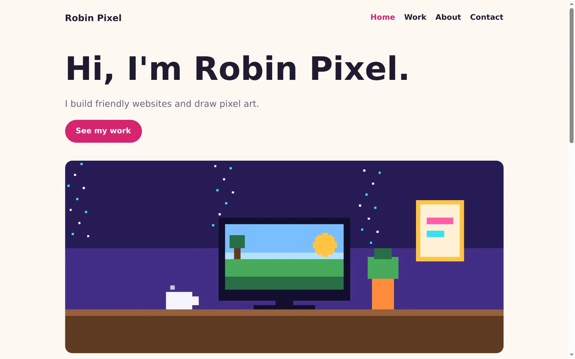
Der Hero bekommt das einzige h1 der Seite, einen Einleitungstext, den Knopf und ein großes Bild:
---
import { fieldAttribute } from '@manablox/live-preview';
import { assetUrl } from '@manablox/public-sdk';
import { assets, link, text } from '../../lib/fields';

interface Props {
  block: Record<string, unknown>;
  path: (string | number)[];
}

const { block, path } = Astro.props;
const headline = text(block.headline);
const subline = text(block.subline);
const image = assets(block.image)[0];
const button = link(block.button);
---

<section class="block block-hero" {...fieldAttribute(path)}>
  {headline && <h1 {...fieldAttribute([...path, 'headline'])}>{headline}</h1>}
  {subline && <p class="lead" {...fieldAttribute([...path, 'subline'])}>{subline}</p>}
  {
    button && (
      <p {...fieldAttribute([...path, 'button'])}>
        <a class="button" href={button.href}>{button.label}</a>
      </p>
    )
  }
  {
    image && (
      <img
        class="rounded"
        src={assetUrl(image, { preset: 'hero' })}
        alt={image.alt ?? ''}
        width={image.width ?? undefined}
        height={image.height ?? undefined}
        {...fieldAttribute([...path, 'image'])}
      />
    )
  }
</section>

<style>
  .block-hero {
    margin-top: 2rem;
  }
  h1 {
    font-size: clamp(2.5rem, 7vw, 4.5rem);
    margin: 0 0 1rem;
  }
  img {
    margin-top: 2.5rem;
    width: 100%;
  }
</style>
assets(block.image)[0] nimmt das erste Bild des Felds, oder nichts. assetUrl(image, { preset: 'hero' }) bittet Manablox um eine Fassung des Bilds, die 1920 Pixel breit ist, damit niemand das ganze Original herunterlädt. clamp(2.5rem, 7vw, 4.5rem) lässt die Überschrift mit dem Fenster wachsen, aber nie unter oder über diese Größen.
Links, die auf jeder Seite funktionieren
Ein Knopf, der auf eine Seite verlinkt, kommt aus der API als contact, ohne den Schrägstrich davor. Auf der Startseite funktioniert das, aber auf /work/bakery-bloom würde der Browser zu /work/contact gehen. Öffne src/lib/fields.ts, such die Funktion link und ergänze den Schrägstrich:
if (!target) return null;
  // A link to a page arrives as "contact", without the leading slash.
  const href = /^([a-z]+:|\/|#)/.test(target) ? target : `/${target}`;
Am Ende derselben Funktion gibst du das neue href zurück:
return { href, label, newTab: value.target === '_blank' };Speichere alles und sieh dir die Startseite an:
Projektkarten
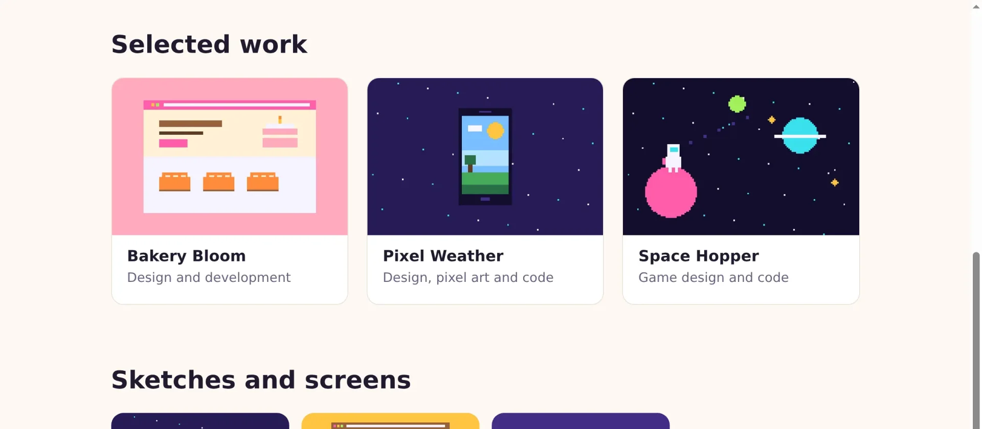
Der Block Project grid kennt nur, welche Projekte er zeigen soll: ihre IDs, Titel und Adressen. Für eine Karte willst du auch das Titelbild und die Rolle. Also lädt die Komponente jedes Projekt selbst, mit expandiertem Titelbild:
---
import { fieldAttribute } from '@manablox/live-preview';
import { assetUrl } from '@manablox/public-sdk';
import { assets, documents, href, text } from '../../lib/fields';
import { manablox } from '../../lib/manablox';

interface Props {
  block: Record<string, unknown>;
  path: (string | number)[];
}

const { block, path } = Astro.props;
const headline = text(block.headline);

// The block only knows which projects to show. Load each one, with its cover.
const projects = await Promise.all(
  documents(block.projects).map((entry) => manablox().get(entry.id, { expand: ['cover'] })),
);
---

<section class="block block-project-grid" {...fieldAttribute(path)}>
  {headline && <h2 {...fieldAttribute([...path, 'headline'])}>{headline}</h2>}
  <div class="cards" {...fieldAttribute([...path, 'projects'])}>
    {
      projects.map((project) => {
        if (!project) return null;
        const cover = assets(project.fields.cover)[0];
        return (
          <a class="card" href={href(project)}>
            {cover && (
              <img
                src={assetUrl(cover, { preset: 'card' })}
                alt={cover.alt ?? ''}
                width={cover.width ?? undefined}
                height={cover.height ?? undefined}
                loading="lazy"
              />
            )}
            <h3>{project.title}</h3>
            <p>{text(project.fields.role)}</p>
          </a>
        );
      })
    }
  </div>
</section>

<style>
  .cards {
    display: grid;
    grid-template-columns: repeat(auto-fill, minmax(16rem, 1fr));
    gap: 1.5rem;
  }
  .card {
    overflow: hidden;
    border: 1px solid var(--line);
    border-radius: var(--radius);
    background: white;
    color: var(--ink);
    text-decoration: none;
    transition: transform 0.2s;
  }
  .card:hover {
    transform: translateY(-4px);
  }
  .card img {
    aspect-ratio: 3 / 2;
    width: 100%;
    object-fit: cover;
  }
  .card h3 {
    margin: 1rem 1.25rem 0.25rem;
    font-size: 1.25rem;
  }
  .card p {
    margin: 0 1.25rem 1.25rem;
    color: var(--muted);
  }
</style>
manablox().get(id, { expand: ['cover'] }) fragt die öffentliche API nach einem Dokument. Promise.all schickt alle Anfragen gleichzeitig ab und wartet auf die letzte, das ist schneller als eine nach der anderen. Weil Astro auf dem Server rendert, bekommen Besucher die fertigen Karten und sprechen nie selbst mit der API.
CSS Grid ordnet die Karten an. repeat(auto-fill, minmax(16rem, 1fr)) heißt: so viele Spalten, wie hineinpassen, jede mindestens 16rem breit, und den Rest des Platzes teilen sie sich. Das sind drei Spalten auf dem Laptop und eine auf dem Handy, ohne eine einzige Media Query.
Die Projektseite
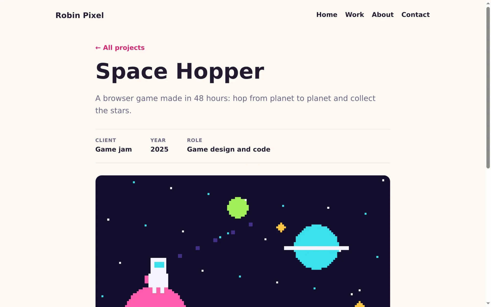
Zuletzt die Seite eines einzelnen Projekts: ein Link zurück, der Titel, die Zusammenfassung, die Eckdaten, das Titelbild, der Text und die Galerie.
---
import { fieldAttribute } from '@manablox/live-preview';
import { assetUrl } from '@manablox/public-sdk';
import { assets, html, text } from '../../lib/fields';
import type { DocumentView } from './index';

interface Props {
  node: DocumentView;
}

const { node } = Astro.props;
const fields = node.fields;
const summary = text(fields.summary);
const cover = assets(fields.cover)[0];
const gallery = assets(fields.gallery);
const body = html(fields.body);

// The facts under the title, left out when empty.
const facts = [
  { label: 'Client', value: text(fields.client) },
  { label: 'Year', value: text(fields.year) },
  { label: 'Role', value: text(fields.role) },
].filter((fact) => fact.value);
---

<article class="project">
  <a class="back" href="/work">← All projects</a>
  <h1 {...fieldAttribute(['title'])}>{node.title}</h1>
  {summary && <p class="lead" {...fieldAttribute(['summary'])}>{summary}</p>}

  <dl class="facts">
    {
      facts.map((fact) => (
        <div>
          <dt>{fact.label}</dt>
          <dd>{fact.value}</dd>
        </div>
      ))
    }
  </dl>

  {
    cover && (
      <img
        class="rounded cover"
        src={assetUrl(cover, { preset: 'hero' })}
        alt={cover.alt ?? ''}
        width={cover.width ?? undefined}
        height={cover.height ?? undefined}
        {...fieldAttribute(['cover'])}
      />
    )
  }

  {body && <div class="body" {...fieldAttribute(['body'])} set:html={body} />}

  {
    gallery.length > 0 && (
      <div class="gallery" {...fieldAttribute(['gallery'])}>
        {gallery.map((image) => (
          <img
            class="rounded"
            src={assetUrl(image, { preset: 'card' })}
            alt={image.alt ?? ''}
            width={image.width ?? undefined}
            height={image.height ?? undefined}
            loading="lazy"
          />
        ))}
      </div>
    )
  }
</article>

<style>
  .project {
    max-width: 48rem;
    margin: 2rem auto 0;
  }
  .back {
    font-weight: 600;
    text-decoration: none;
  }
  h1 {
    font-size: clamp(2.5rem, 6vw, 3.5rem);
    margin: 1rem 0 0.5rem;
  }
  .facts {
    display: flex;
    flex-wrap: wrap;
    gap: 1rem 3rem;
    margin: 2rem 0;
    padding: 1.25rem 0;
    border-block: 1px solid var(--line);
  }
  dt {
    color: var(--muted);
    font-size: 0.8rem;
    font-weight: 700;
    text-transform: uppercase;
    letter-spacing: 0.05em;
  }
  dd {
    margin: 0;
    font-weight: 600;
  }
  .cover {
    width: 100%;
  }
  .body {
    margin: 2rem 0;
    font-size: 1.125rem;
  }
  .gallery {
    display: grid;
    grid-template-columns: repeat(auto-fill, minmax(14rem, 1fr));
    gap: 1rem;
  }
</style>
Die Eckdaten sind eine Liste aus Paaren von Bezeichnung und Wert. .filter((fact) => fact.value) wirft die leeren hinaus, sodass ein Projekt ohne Kunden einfach keine Kundenzeile hat. Im HTML werden sie zu einem <dl>, dem HTML-Element für Begriffe und ihre Beschreibungen. Die Beschriftungen Client, Year und Role sind englisch, weil Robins Website englisch ist; schreib sie in der Sprache deiner Website.
Eine Liste aller Projekte, ohne Code
Die Seite Work hat bisher nur einen Textblock. Statt eine neue Komponente zu schreiben, verwendest du das Projektraster noch einmal: Öffne Work im Admin, klick auf Add block und wähl Project grid.
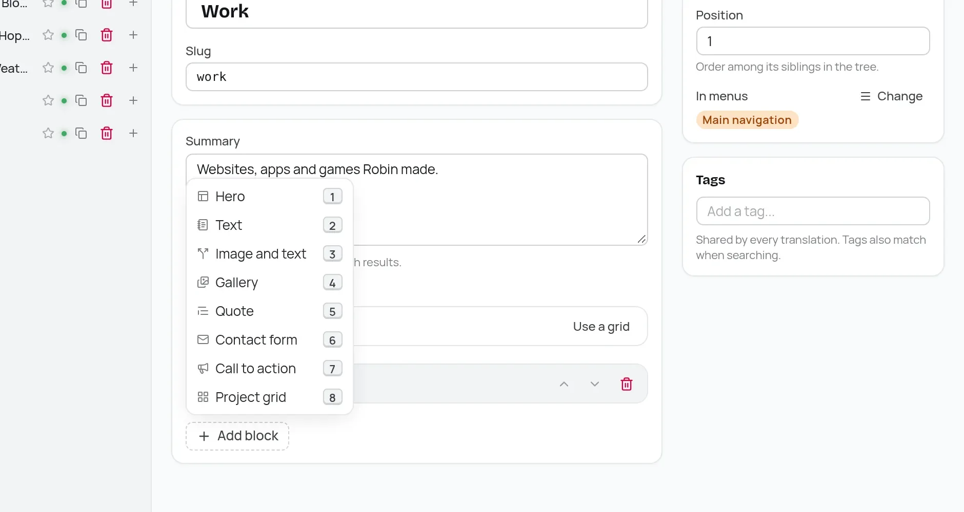
Nenn ihn All projects und verlinke deine Projekte mit Link content, wie auf der Startseite. Der alte Textblock wiederholt den Seitentitel, lösch ihn also mit seinem Papierkorb-Symbol. Dann veröffentlichst du.
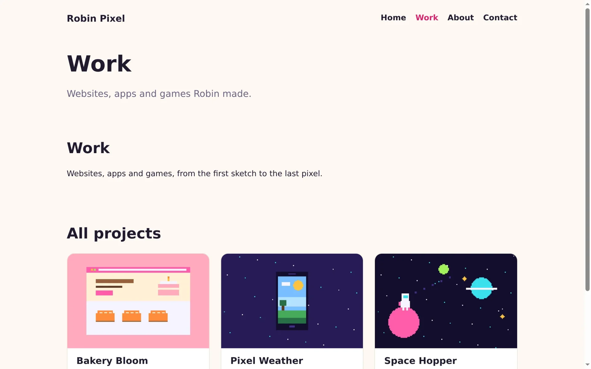
Startseite und Projekte sehen jetzt aus wie ein Portfolio. Im nächsten Teil gestaltest du die übrigen Abschnitte, ergänzt einen Kontaktknopf und machst die Website bereit für die Welt.